
Let’s take a look at some free WordPress themes that have a focus on strong typography and legibility. This is perfect when you want your visitors to be able to just start reading right away and not have to figure out where to start.
Some people would describe these themes as minimal or clean. They are all definitely based on some sort of obvious grid system. In all of these themes, there is a lot of negative / empty spaces which give the eye a chance to rest and not be overwhelmed with clutter. Here’s an overview of all three.

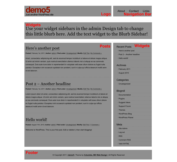
The screenshots used below in each theme mini-review will have gray boxes overlay-ed so you can see the layout of content modules.
Platform Pro by Pagelines Let’s start off with something the most complex in this theme round, Platform Pro. It’s more feature rich than the other two themes and has an theme control panel with a lot of controls.

I am using this theme right now on my StartupInsider.net website. So what do I like about it?
I like that the fonts are perfectly sized/proportioned and colored with subdued grays. I can tell the designers of this theme spent a lot of time fine tuning these things. There’s also a mixture of both of serif and sans-serif fonts which makes certain areas easier to distinguish. It supports the featured image control and has automatic thumbnail generation for the home page.
Out of all the themes in this article, this one didn’t require any tweaking to the CSS and works great out of the box. Pageline offers a “pro” version but the basic version is free.
Get it: Platform Pro
Inuit Types – Here’s a very unique theme that features a 2 column post area on the home page. Why do I like this? It gives almost equal importance to 4 or more posts and not force the reader to scroll down the page. There’s also a provision for a widget message area above the posts using large headline text.

You can see this theme in action on my StartupK.it site. This particular version is based from Dreamhost’s standard WordPress installation. I wasn’t happy with the stock version because it had a graphical pattern running across the top of the page and the fonts on the page were a mish-mash of Verdana, Arial, and Times. I “fixed” these in my modified version. Note that Bizz Themes has a newer revamped version of this theme with a featured post slider and a lot more features using a theme control panel. I think the early version retains the spirit of strong typography more than the newer version.
Get it: Modified Inuit Types (see bottom of styles.css for override settings) Get it: Inuit Types advanced
Clean Home by MidMo Design I like this theme because it has a very bold site name at the top and mixes both sans-serif and serif font. The layout has lots of spacing using two columns with a large main column and right sidebar. There’s also no fancy schmancy control panel. If you want that, you’d have to buy the “Pro” version for $20 at Gazelle themes. The pro version also gives you extra color schemes and support from the developers.

What don’t like? I am not crazy about the excessive use of dotted lines and underlined hyperlinks. But all that could be easily changed through the CSS. I think the Dreamhost version has more refined typography than the one that’s available from MidMo. See the official MidMo version in action used as their home page.
Get it: Dreamhost version | MidMo’s official version
More: A similar theme to Clean Home is Cleanr available at WordPress.org. It’s actually the theme we’re currently using here!
We’re lucky that these developers have released free versions of these themes. They all excel with their crisp and clean typography. If you’re looking for a magazine style theme give Platform Pro a try. If you’re looking for pure read-ability, give the early version Inuit Types a try. And if you’re looking for a lot chunky text and a strong grid, Clean Home is a great choice.