Use WordPress to track projects and communicate better

Originally published at our sister site: StartupInsider.net

We’re big fans of Basecamp (a relatively minimalist project management web app) around here but it can get pricey if you start adding a lot of projects. We also use Twitter a lot around here.

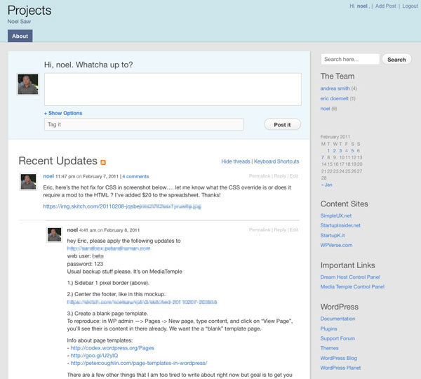
That’s why when we ran across Automattic’s P2 theme we were thrilled. It’s a WordPress theme that includes extra functionality to combine the fast communication of Twitter and threaded messaging of Basecamp. There’s a main column where you can post your latest activity or start a message thread. Below that update area are previous conversations in a threaded view.

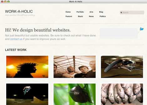
We were even more thrilled when we found Templatmatic’s GTD theme which adds more features like tagging posts and ability to add file attachments. This theme also adds an option to hide all the messages if a user is not logged in so it’s not exposed to the public.

These two themes aren’t going to replace Basecamp or compete with in terms of features but if you’re tired of having to search your emails for status reports and “what’s next”, then give either system a try. The only thing missing is that you can’t title your posts right now but you can filter by parent posts. You’ll need a self hosted WordPress blog site so unfortunately this won’t work if you have a WordPress.com hosted blog.

If you want to get some more mileage from your new “intranet”, I recommend adding these sidebar widgets to either theme to make them go further: first add the Login with Ajax plugin – so you can quickly login from the sidebar. The Tag Cloud widget is also great so users can filter messages by tags.

Also consider adding the default calendar widget to see a quick visual calendar. And finally you can add important URLs (example: logins to other systems) via the text widget or blogroll to the sidebar.

Get it: Templatmatic’s GTD theme | Original P2theme

Update: We’ve released our own special remix of GTD/P2 called P2 Reloaded

Theme company spotlight: Graph Paper Press

You have probably noticed there a lot and I mean a lot of commercial WordPress theme companies out there. It seems like a new one is popping up every month. Let’s take a quick look at one of the veterans, Graph Paper Press.

Graph Paper Press specializes in photography focused themes so the grid paper metaphor and minimal use of text is prevalent in most of their themes. So you’ll see a lot of big photos blocks and less emphasis on text. The great thing about GPP is they give away most of their themes away for free use along with some light documentation. If you need support, then you’ll have to pay of course.

Let’s take a quick look at two of my favorite themes: Workaholic and Berlin.

workaholic-gpp.png

Workaholic is a photography/art portfolio theme that I use at my SGVPhotos.com site. It has a home page intro and rows of 3 across thumbnails. When you rollover the thumbnails, it reveals the title and category. It’s perfect when you think pictures are worth a thousand words.

When you drill down to an inner page, there are tabs that will allow the visitor to see multiple photos on the same page via AJAX. There’s also an automatically generated list of similar photos to the right. As a testament to the solid code behind it, I was using a version of Workaholic that is several versions behind the current version and I recently upgraded the site from WordPress 2.8 to 3.04 and the site still works beautifully with the older Workaholic theme.

berlin-gpp.png

Berlin is a deviation from their usual that’s meant for both photos and text. It has a large article block in the left column and there’s a smaller right column that can be used to show posts or other widgets. It’s very easy on the eyes and it’d be great for a magazine or news blog. I haven’t used Berlin myself so other than seeing the front end, I don’t know about the workflow and backend usability.

So hats off to the Graph Paper Press folks for giving back to the WordPress community in such a big way with a ton of polished free to try themes.

Get it: Workaholic | Berlin

WordPress.com now offering premium themes

If you’re using WordPress.com, meaning your blog is hosted by Automattic / WordPress, then you have two new theme choices as of today. These two new premium themes will set you back around $50-70.

If you’re on your WP.com account, head over to Appearance -> Themes and you’ll see choice one is  “Headlines” by WooThemes.

It’s probably suited for for newspaper/magazines with a very clean layout with two columns, choice of 15 duo-tone color schemes, featured post, and previous posts and thumbnails. This one will set you back $45 for a life-time license.

The second one is “Shelf” by Theme Foundry. This one looks beautiful – it’s designed for posting your latest photo, music track, and thoughts.

This one is price interestingly at $68 – close to $70. We’d be curious to see how many takers there would be at that relatively higher price point. I think this is definitely a test to see what the upper end of consumer appetite (or tolerance) is for a cool looking theme. Consider that self hosted WordPress themes range any where from $20 to $80 or more.

It’d be interesting to be a fly on the wall to listen to the royalty negotiations between Automattic and the theme publishers.  The varying price and starting with only two themes right now indicates that it’s experiment and Matt Mullenweg himself confirms the experimental status thought in a blog posting at Themeshaper. TechCrunch estimates that Automattic brings in around $1 million dollars a month – most of it from premium service so we’re guessing this new theme model may become an important revenue stream in the long run.

In that posting, Matt also says this “premium theme” project was a long time in the making with code licensing compliance issues being worked out by the major theme studios. He also reveals that an internal team at Automattic worked to bring 29 new/redesigned themes to WP.com last year. He ends with a note that 2011 should bring a “significant number” of new themes – both free and premium.

More: Official WordPress.com Post | TechCrunch

Round up of 3 crisp and clean WordPress themes

Let’s take a look at some free WordPress themes that have a focus on strong typography and legibility. This is perfect when you want your visitors to be able to just start reading right away and not have to figure out where to start.

Some people would describe these themes as minimal or clean. They are all definitely based on some sort of obvious grid system. In all of these themes, there is a lot of negative / empty spaces which give the eye a chance to rest and not be overwhelmed with clutter. Here’s an overview of all three.

The screenshots used below in each theme mini-review will have gray boxes overlay-ed so you can see the layout of content modules.

Platform Pro by Pagelines Let’s start off with something the most complex in this theme round, Platform Pro. It’s more feature rich than the other two themes and has an theme control panel with a lot of controls.

I am using this theme right now on my StartupInsider.net website. So what do I like about it?

I like that the fonts are perfectly sized/proportioned and colored with subdued grays. I can tell the designers of this theme spent a lot of time fine tuning these things. There’s also a mixture of both of serif and sans-serif fonts which makes certain areas easier to distinguish. It supports the featured image control and has automatic thumbnail generation for the home page.

Out of all the themes in this article, this one didn’t require any tweaking to the CSS and works great out of the box. Pageline offers a “pro” version but the basic version is free.

Get it: Platform Pro

Inuit Types – Here’s a very unique theme that features a 2 column post area on the home page. Why do I like this? It gives almost equal importance to 4 or more posts and not force the reader to scroll down the page. There’s also a provision for a widget message area above the posts using large headline text.


You can see this theme in action on my StartupK.it site. This particular version is based from Dreamhost’s standard WordPress installation. I wasn’t happy with the stock version because it had a graphical pattern running across the top of the page and the fonts on the page were a mish-mash of Verdana, Arial, and Times. I “fixed” these in my modified version. Note that Bizz Themes has a newer revamped version of this theme with a featured post slider and a lot more features using a theme control panel. I think the early version retains the spirit of strong typography more than the newer version.

Get it: Modified Inuit Types (see bottom of styles.css for override settings) Get it: Inuit Types advanced

Clean Home by MidMo Design I like this theme because it has a very bold site name at the top and mixes both sans-serif and serif font. The layout has lots of spacing using two columns with a large main column and right sidebar. There’s also no fancy schmancy control panel. If you want that, you’d have to buy the “Pro” version for $20 at Gazelle themes. The pro version also gives you extra color schemes and support from the developers.

What don’t like? I am not crazy about the excessive use of dotted lines and underlined hyperlinks. But all that could be easily changed through the CSS. I think the Dreamhost version has more refined typography than the one that’s available from MidMo. See the official MidMo version in action used as their home page.

Get it: Dreamhost version | MidMo’s official version

More: A similar theme to Clean Home is Cleanr available at WordPress.org. It’s actually the theme we’re currently using here!

We’re lucky that these developers have released free versions of these themes. They all excel with their crisp and clean typography. If you’re looking for a magazine style theme give Platform Pro a try. If you’re looking for pure read-ability, give the early version Inuit Types a try. And if you’re looking for a lot chunky text and a strong grid, Clean Home is a great choice.

Theme of the week: Polar Media

I started off as a print designer many eons ago. So when I see a WordPress theme with great typography, I take notice.

We think “Polar Media” by “Bizz Themes” manages to blend strong photographic elements with very sharp typography. It’s designed for magazines with blocky photo featured posts at the top of the page and posts right below that along with the typical right column widget. The footer area has a lot of customization options.

The choice of fonts, type and module spacing is easy on the eyes. Best of all, you can get the lite version for free! We haven’t heard of Bizz Themes until a few days ago but it looks they have an impressive selection of themes along with a powerful framework used across their other themes. We’ll keep an eye on them.

Get it: “Polar Media”

Great way to find themes visually – Theme Finder

Looking for a beautiful WordPress theme? The choices have become daunting with 1,000s of themes. We ran across the theme finder site from WP candy that might make it easier for WordPress site builders to find that perfect look.

The concept is brilliant, show a bunch of theme home page thumbnails along with some criteria at the top of the page to filter results. The filters include general color scheme, free, paid, number of columns, and “flexible” (not sure what that means yet). Clicking on a filter, will gray out non-matching themes. Brilliant.

ThemeFinder.jpg

Check it out today: themefinder.wpcandy.com

Quick Tip: Add excerpts to search results page

If you’ve tried searching for a keyword on a WP site, you may have noticed that the search results don’t always include an excerpt of matching page(s). While you’re at it, have you tried the search function on your site? The missing excerpt is not WordPress’s fault, in reality the theme designer neglected or chose not to include that feature in the theme.

Here’s how to quickly add an excerpt to your search results page by hacking your theme. Important: make sure you have a copy of your original theme and/or backup the existing search.php page ready to restore in case you get in trouble. We’re not responsible if you muck up your site.

In WordPress admin, select Appearance -> Editor -> Search.php (screenshot below) Add the following tag after the end of the headline tag, usually </h2>:

<?php the_excerpt(); ?>

And hit “Save” and go try a search on your site!

the_excerpt_wordpress_code.jpg

Another tip, now that you’ve improved it with excerpts,  why not improve it further by trying Relevanssi plugin? Relevannsi will help bump up the quality of matching results. You’ll still need to  do a bit of work tagging your posts or pages but it’s worth it.

PadPressed update and another iPad theme

A few days ago we covered PadPressed now known as “OnSwipe” raised $1 million. Now they have some competion from WPTouch Pro. We asked them why their theme didn’t work so well in protrait mode. Maybe they’re busy celebrating their round of funding, because we never heard back from them.

Well there’s new competition from WPtouchPro 2.1 by Brave New Code, adds iPad support. We’ll take a look at it in the next few days and do a mini review. Meanwhile you can download the 1.9 version for iPhone/iPod touch for free.

Cheat Sheet: Anatomy of a WordPress theme

If you’re learning how to create your own WordPress theme, check out this succinct but informative cheat sheet called “Anatomy of a WordPress Theme” over at Yoast.

While this is not a tutorial or a detailed how to, this will give you a big picture overview of how WordPress works.

The only thing we think it’s missing is it doesn’t talk about page templates.

Theme of the Week: Spectacular from Smashing Magazine

Looking for a WordPress theme that’s slightly retro and sepia or paper bag brown color ready to go out of the box? Check out Smashing Magazine’s new and best of all, free theme called “Spectacular.” There’s a large site name area above to proudly brand your site. The home page layout is interesting with a large main feature area that shockingly doesn’t have the trendy Jquery slider. Check out their live demo.

Get it: Spectacular Theme