Sequential Foundation Photo Gallery plugin

A client recently asked me if they could upload a bunch of photos onto a page or post and have WordPress automatically lay them out sequentially right next to each other without any gaps or spaces. Our first thought was that WordPress should already do this by default but we checked and yikes it doesn’t have that feature yet.

So our friend Wok at Thinkademic wrote this custom plugin for us that will let you upload a bunch of pictures for you neatly lined up in a row next to each other. There’s no fancy schmancy JQuery slider effects or transitions. The plugin just generates a plain old grid of pictures lined up next to each other.

Once you have the plugin uploaded and activated, simply click on photo media upload button built into the post/page editor to batch upload a bunch of pictures. You’ll have a choice of how many columns across and how you want the pictures sorted by.

You’ll want to pre-size your pictures with Photoshop or another image editor so they’re at least the same height. Depending on the width of the page, the plugin will show as many images that can fit into a row.

If you specify imagesize="thumbnail" in the gallery shortcode parameters, it will use whatever thubmnail value you have setup in your media settings.

Here’s some CSS that you can add to your theme or “My Custom CSS” plugin to help style the layout :
.thefoundation-gallery img { margin: 0 !important; padding: 0 !important; float: left;}

See the example at the bottom of this page…

The usual fine print…
As always with any open source software, use the plugin at your own risk. The plugin is offered “as-is” without any warranties. We recommend installing this on a test site and thoroughly trying it out before you apply it to your live site. We’ll try to answer any questions you have here in the comments but can’t guarantee a timely response.

Get it: SequentialGallery-1.0

Example gallery – images from InterfaceLift.com:

Use WordPress to track projects and communicate better

Originally published at our sister site: StartupInsider.net

We’re big fans of Basecamp (a relatively minimalist project management web app) around here but it can get pricey if you start adding a lot of projects. We also use Twitter a lot around here.

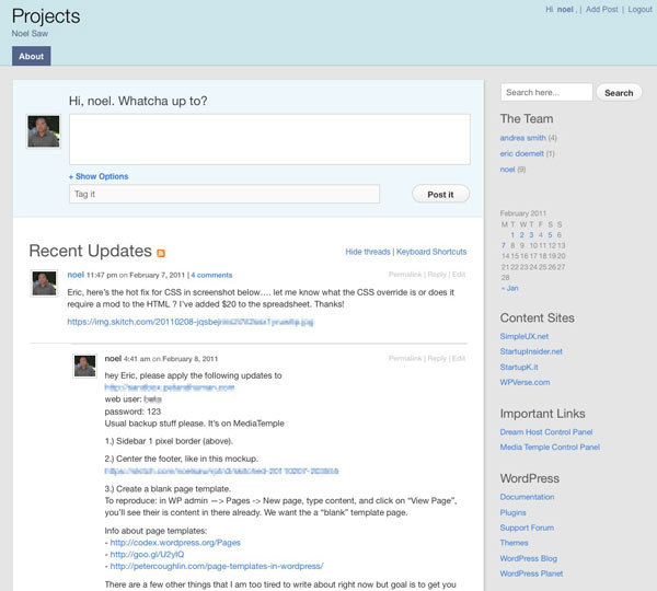
That’s why when we ran across Automattic’s P2 theme we were thrilled. It’s a WordPress theme that includes extra functionality to combine the fast communication of Twitter and threaded messaging of Basecamp. There’s a main column where you can post your latest activity or start a message thread. Below that update area are previous conversations in a threaded view.

We were even more thrilled when we found Templatmatic’s GTD theme which adds more features like tagging posts and ability to add file attachments. This theme also adds an option to hide all the messages if a user is not logged in so it’s not exposed to the public.

These two themes aren’t going to replace Basecamp or compete with in terms of features but if you’re tired of having to search your emails for status reports and “what’s next”, then give either system a try. The only thing missing is that you can’t title your posts right now but you can filter by parent posts. You’ll need a self hosted WordPress blog site so unfortunately this won’t work if you have a WordPress.com hosted blog.

If you want to get some more mileage from your new “intranet”, I recommend adding these sidebar widgets to either theme to make them go further: first add the Login with Ajax plugin – so you can quickly login from the sidebar. The Tag Cloud widget is also great so users can filter messages by tags.

Also consider adding the default calendar widget to see a quick visual calendar. And finally you can add important URLs (example: logins to other systems) via the text widget or blogroll to the sidebar.

Get it: Templatmatic’s GTD theme | Original P2theme

Update: We’ve released our own special remix of GTD/P2 called P2 Reloaded

Quick Tip: Add a smooth call to action button anywhere

Here’s a time saver, if you want to add a nice looking “call to action” (CTA) button like “Signup” or “Download” to your site. Normally that would require a lot of steps: design it in Photoshop, upload a graphic into the media library, and then insert it into your post. And then link it up. Wow, that’s a lot of steps and time.

Well there’s a WordPress plugin to speed that process up a lot – try WP CSS Button plugin and use their short code almost anywhere on the site to display a button like this:
[CSSBUTTON target=”http://startupsinsider.net” color=”FF8A00″ textcolor=”ffffff”]Signup[/CSSBUTTON]
Once the plugin is installed and activated, you simply insert this shortcode in your post editor:

[CSSBUTTON target="http://startupsinsider.net" color="FF8A00" textcolor="ffffff"]Signup[/CSSBUTTON]

You can also replace the hex button text/background color and hyperlink with anything you’d like. And here’s a tip from us, if your site shows an underlining effect on the left/right side, insert this code to the bottom of your theme’s CSS file to hide it.
.button_col a { border-bottom: none; }

Once you make the 2-3 min. investment in time, adding nice looking buttons could take just seconds!

Get it: WP CSS Button plugin

Great way to find themes visually – Theme Finder

Looking for a beautiful WordPress theme? The choices have become daunting with 1,000s of themes. We ran across the theme finder site from WP candy that might make it easier for WordPress site builders to find that perfect look.

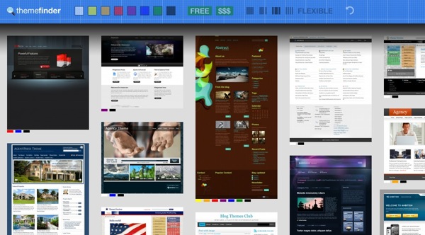
The concept is brilliant, show a bunch of theme home page thumbnails along with some criteria at the top of the page to filter results. The filters include general color scheme, free, paid, number of columns, and “flexible” (not sure what that means yet). Clicking on a filter, will gray out non-matching themes. Brilliant.

ThemeFinder.jpg

Check it out today: themefinder.wpcandy.com

A few more thoughts on Mars Edit 3

I bought Mars Edit 3 a few weeks ago and wrote a quick review. So time for an update! Here are some things that I really think make it an indispensible tool.

My favorite is that it’s easy to use to cross post from one blog to another. Simply open an existing post to edit, then from the drop down menu select a new blog site and click on publish. You will loose the existing categories and need to re-define them (understandable) but the tags will stay in-tact.

I also realize this maybe a good offline back up tool for your content especially if you increase the number of posts for it to sync. Update: Just noticed the dialog box to increase the post limit has a performance warning. I’ve asked the developer for clarification.

So four things that I wish it would have are…

I wish Mars Edit had the ability to schedule posts to publish on a future date.
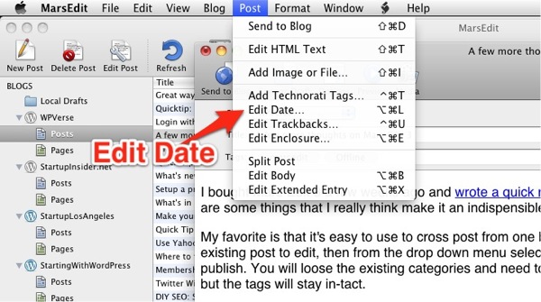
Update: I was informed by the developer that you can actually do this. First, open up the selected post to edit and once open, go to drop down menu for “Post”, select “Edit Date” to specify the future date to publish on. It’s too bad this feature is kind of hidden away and not part of the post editor window.

marsedit-edit-date.jpg

Secondly,  it’d be nice to be able to set line spacing aka leading in the editor. The default font is a bit too small for me but it can be increased but I don’t see a way to increase the leading.

Thirdly, I wish the keyboard shortcut to define a link was not so complicated, a simple Apple + l (for link) would be nice. And why not also allow a right click to assign a link?

And one last feature wish would be for a way to change the author attribution when editing a post.

Other than these relatively minor issues, I readily recommend Mars Edit for writing if you’re on the Mac.

Get it: Mars Edit 3

Offline WP editor: Mars Edit

In the past, I’ve mentioned tools like Scribefire that work within your web browser to help you quickly post WordPress content. I’ve been using it for a while and I like it minus the occasional hiccups when it doesn’t clear the previous content and I accidentally overwrite an existing post. You could probably chalk some of that up to user error/impatience.

I always think there’s ten different ways to do something and sometimes it’s good to reduce the so-called “background noise” by just focus on the writing and not have all the crazy visual distractions of the web in front of you. Enter Mars Edit 3 by Red Sweater for the Mac, an elegant off-line blog editor that works with WordPress (of course) and other blog systems. You can use it to manage multiple blog sites on multiple platforms.

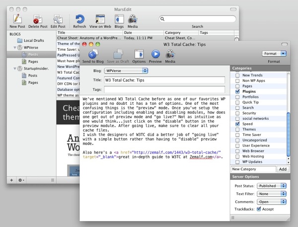
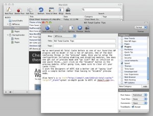
Mars Edit lets you create new posts and pages while having the ability to edit existing ones too. It gives you almost the same editing capabilities as WordPress’ built in editor including creating categories and tags. You can also upload pictures and media through the Mac interface.

One neat touch is that it will auto-detect URLs in your clipboard and automatically paste them in when you insert a link.

One interesting incident during my testing that may also throw off new users. I saved a draft of this post and thought it would be uploaded to my site as a draft but instead it saved this post locally as a draft file. Not a big deal, after I found the draft but for a few moments, it was a yikes moment. It would be nice if it gave you the option of uploading a draft since some users may choose to leave their computer at home and finish the rest of the post on say an iPad on the road.

I also wish it had better media management as currently local file pictures show up only in a thumbnail view. It does have a quick search feature to drill down by file name but it’s too bad it doesn’t have a list view sortable by date. It would also be nice if Mars Edit integrated with some of the WP picture lightbox plugins so when you add a picture, the image style gets incorporated automatically.

To be entirely fair, Mars Edit wasn’t designed to be just a WordPress editor but it also works with Tumblr, Squarespace, and other blogs. Overall, it’s a well designed product and I’ll be buying Mars Edit very soon. In the meanwhile, if you’re interested there’s a trial version you can download.

Get it: Mars Edit 3

Cheat Sheet: Anatomy of a WordPress theme

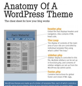
If you’re learning how to create your own WordPress theme, check out this succinct but informative cheat sheet called “Anatomy of a WordPress Theme” over at Yoast.

While this is not a tutorial or a detailed how to, this will give you a big picture overview of how WordPress works.

The only thing we think it’s missing is it doesn’t talk about page templates.

Time Saver: use Pixelpipe to push to 100+ networks

How would you like to have the ability to push (simple) content into WordPress, Tumblr, TypePad, etc. with one click? Or how about sending out a status update to Facebook, Twitter, and Google Buzz with a single little click. Check out Pixelpipe.  It’s a free web app service where you can setup all your social network accounts and use one interface to write content and publish it to multiple networks.

One of my favorite features? The ability to send an update through your IM client, just open up an IM window and select their “bot” contact/buddy, then type your message and hit enter. Voilà, done!

Expect a slight delay (1-2 minutes) for your content to show up at each network but ultimately it saves a lot of time doing each one manually. Get it: Pixelpipe

PadPressed Update

A few months ago, we bought the App Sumo Bundle which included the PadPressed theme. At the time, the plugin/theme combo seemed hard to install and the support channel wasn’t quite there.

We just came back to try it out with a new 1.5.1 release (free for existing customers) and we’re happy to report the documentation has gotten much better and there’s a now a support forum. The developers have put some thought into the features including the ability to pull your site logo as the “home” screen icon when you bookmark the site on an iPad.

The only thing we’re not happy about is that the CoverPad theme doesn’t work well in landscape mode when viewing on the iPad, by that we mean the inner page thumbnails disappear when the iPad is rotated into landscape mode. But otherwise it maybe worth $50 to get your portfolio up quickly on an iPad. Try out our test site on your iPad.

Get it: PadPressed theme

Great visual tools for communicating with clients

I know this post isn’t WP related but if you’re doing a lot of web design work, using either app mentioned below could save you a ton of time…

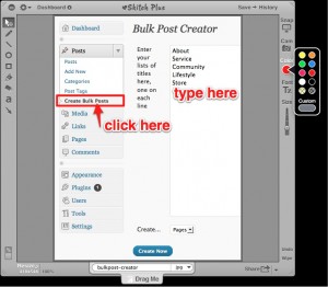
You’ve probably heard the old adage “a picture is worth a thousand words”? If you and your client just can’t get on the same page using email or even voice communication, why not try using a visual mark-up tool like Skitch or Jing? Skitch is a Mac-only tool that let’s you quickly snapshot your screen, draw arrows, write up annotation/notes, and publish to a web page very, very quickly. How quickly? Well how about under a minute start to finish?  Skitch has been in beta for almost 2 years and they’ve finally released “v1.0” that’s even more polished and better that I ponied up $15 for one year of “pro” features.

How about Jing? Jing’s advantage is that it captures up to 5 minutes of your on-screen activity and you can record your voice during the capture to annotate it. Jing’s also has a cross platform – it works on both Mac and Windows. Like Skitch, I paid for the pro version for $15/year. The only draw back is that Jing’s workflow is not as quick as Skitch but it makes up for that with the screencast function.

Get it: Skitch | Jing