Looking for a quick way to replace the WordPress logo on the admin login page with your own or your client’s? Take a look at this appropriately named “Login Logo” plugin.
Plugin of the week: Autoptimize to speed up your WP site
One of the best ways to get new visitors to your website and to keep them coming back is to make sure your site loads up quickly. Most experts recommend having your home page load in about 2-3 seconds. If your site is taking more than 5 seconds for the average user, then you have a problem. One of the first steps is to get educated with Yahoo’s Y!Slow tutorials.
Next you can take advantage of some WordPress plugins to help speed up your page. We did a quick review of the popular W3 Total Cache a few weeks ago and overall we liked it. It seemed to have shaved off 1-2 seconds from our home page. The problem with W3 Total Cache is that there are a ton of options and some of the “on” or “off” switches are labeled in a confusing way.
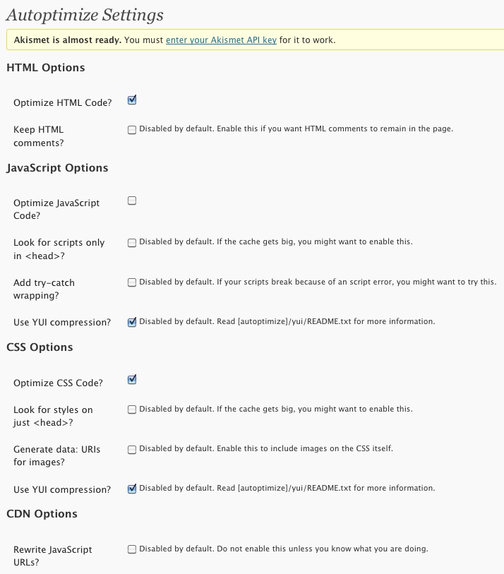
So if you’re looking for something simpler but possibly as effective give Autoptimize a try. Autoptimize’s features are not as extensive as seen by their control panel but nevertheless it has the important features like HTML code, CSS, and Javascript optimization and compression.
We’ve been using it for the past few weeks and think it works really well. We recently did some performance testing with a clone copy of this site on a fresh WordPress installation and noticed that Autoptimizer does make a difference and shaved off 1 second versus not having it installed.
Autoptimize also supports off loading content to a CDN but we haven’t tried it yet but we are going to jump into that water very soon to help speed up our own sites.
Neither Autoptimize nor W3 Total Cache are a magic bullet to solve your WordPress performance problems – especially if your web hosting company has server capacity and/or slow connection issues. But installing the Autoptimize plugin is an almost no-brainer way to squeeze some speed out of your WordPress server.
Get it: Autoptimize
Round up of 3 crisp and clean WordPress themes
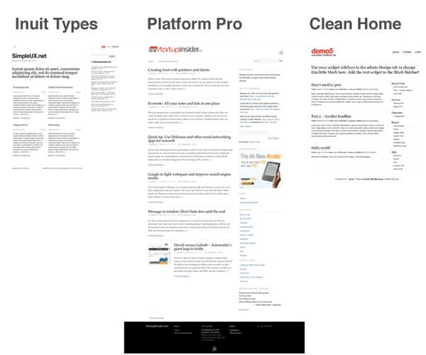
Let’s take a look at some free WordPress themes that have a focus on strong typography and legibility. This is perfect when you want your visitors to be able to just start reading right away and not have to figure out where to start.
Some people would describe these themes as minimal or clean. They are all definitely based on some sort of obvious grid system. In all of these themes, there is a lot of negative / empty spaces which give the eye a chance to rest and not be overwhelmed with clutter. Here’s an overview of all three.
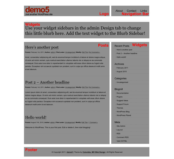
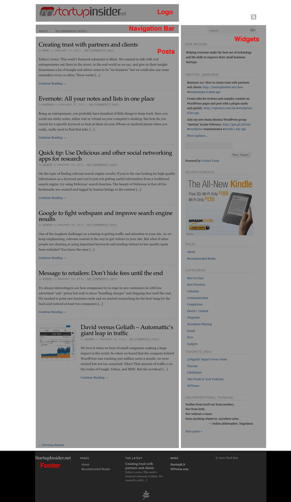
The screenshots used below in each theme mini-review will have gray boxes overlay-ed so you can see the layout of content modules.
Platform Pro by Pagelines Let’s start off with something the most complex in this theme round, Platform Pro. It’s more feature rich than the other two themes and has an theme control panel with a lot of controls.
I am using this theme right now on my StartupInsider.net website. So what do I like about it?
I like that the fonts are perfectly sized/proportioned and colored with subdued grays. I can tell the designers of this theme spent a lot of time fine tuning these things. There’s also a mixture of both of serif and sans-serif fonts which makes certain areas easier to distinguish. It supports the featured image control and has automatic thumbnail generation for the home page.
Out of all the themes in this article, this one didn’t require any tweaking to the CSS and works great out of the box. Pageline offers a “pro” version but the basic version is free.
Get it: Platform Pro
Inuit Types – Here’s a very unique theme that features a 2 column post area on the home page. Why do I like this? It gives almost equal importance to 4 or more posts and not force the reader to scroll down the page. There’s also a provision for a widget message area above the posts using large headline text.
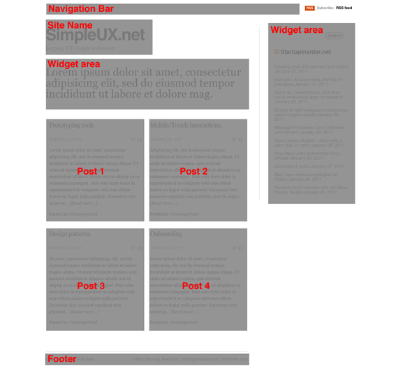
You can see this theme in action on my StartupK.it site. This particular version is based from Dreamhost’s standard WordPress installation. I wasn’t happy with the stock version because it had a graphical pattern running across the top of the page and the fonts on the page were a mish-mash of Verdana, Arial, and Times. I “fixed” these in my modified version. Note that Bizz Themes has a newer revamped version of this theme with a featured post slider and a lot more features using a theme control panel. I think the early version retains the spirit of strong typography more than the newer version.
Get it: Modified Inuit Types (see bottom of styles.css for override settings) Get it: Inuit Types advanced
Clean Home by MidMo Design I like this theme because it has a very bold site name at the top and mixes both sans-serif and serif font. The layout has lots of spacing using two columns with a large main column and right sidebar. There’s also no fancy schmancy control panel. If you want that, you’d have to buy the “Pro” version for $20 at Gazelle themes. The pro version also gives you extra color schemes and support from the developers.
What don’t like? I am not crazy about the excessive use of dotted lines and underlined hyperlinks. But all that could be easily changed through the CSS. I think the Dreamhost version has more refined typography than the one that’s available from MidMo. See the official MidMo version in action used as their home page.
Get it: Dreamhost version | MidMo’s official version
More: A similar theme to Clean Home is Cleanr available at WordPress.org. It’s actually the theme we’re currently using here!
We’re lucky that these developers have released free versions of these themes. They all excel with their crisp and clean typography. If you’re looking for a magazine style theme give Platform Pro a try. If you’re looking for pure read-ability, give the early version Inuit Types a try. And if you’re looking for a lot chunky text and a strong grid, Clean Home is a great choice.
Theme of the week: Polar Media
I started off as a print designer many eons ago. So when I see a WordPress theme with great typography, I take notice.
We think “Polar Media” by “Bizz Themes” manages to blend strong photographic elements with very sharp typography. It’s designed for magazines with blocky photo featured posts at the top of the page and posts right below that along with the typical right column widget. The footer area has a lot of customization options.
The choice of fonts, type and module spacing is easy on the eyes. Best of all, you can get the lite version for free! We haven’t heard of Bizz Themes until a few days ago but it looks they have an impressive selection of themes along with a powerful framework used across their other themes. We’ll keep an eye on them.
Get it: “Polar Media”
Creating tabbed content
If you need to have a ton of content to be presented on single page it can be challenging so the reader doesn’t become overwhelmed. Dividing your content into a tabbed module is one possible solution It’s especially helpful if one section of content is going to be really long (tall) and the user may want to jump ahead to a different section. One way to do that would be by putting the content into tabs on a single page.
Some possible use cases are for product reviews which could be broken up into: intro, review, and conclusion. Here’s a quick example – click on tabs!
{tab=Intro}
The product was designed by ACME in 2010. Steve Ive and Johnny Jobs collaborated on this brilliant design.
{tab=Review}
Lorem ipsum dolor sit amet, consectetur adipisicing elit, sed do eiusmod tempor incididunt ut labore et dolore magna aliqua. Ut enim ad minim veniam, quis nostrud exercitation ullamco laboris nisi ut aliquip ex ea commodo consequat. Duis aute irure dolor in reprehenderit in voluptate velit esse cillum dolore eu fugiat nulla pariatur. Excepteur sint occaecat cupidatat non proident, sunt in culpa qui officia deserunt mollit anim id est laborum.
{tab=Conclusion}
It’s a great product! Buy it today
{/tabs}
So how do you do this with WordPress? We ran across this plugin called “WordPress Tabs Slides” and it works brilliantly. It’s Ajax driven so it’s almost instantaneous and the user doesn’t feel like they’re being taken onto another page. You use very simple shortcode to mark sections in your content within your post or page and you’re done.
Congrats and thanks to Abdul Ibad for coding a great plugin for the WordPress community.
Google to fight webspam and improve search engine results
One of the toughest challenges running a web site is to get traffic and attention to your site. As we keep emphasizing, relevant content is the way to get visitors to your site. But what if other people are cheating at using important keywords and sending visitors to low quality spam farm websites? You know the ones with that lead visitors on an endless click spree with pop up windows and signup prompts.
Once Google was the king of clean and relevant results but now these days, Google search results are filled with spam sites which are designed to trick the user into looking counterfeit goods or other nefarious activities. These sites trick Google into thinking they’re relevant with various methods. Fortunately, in a recent official blog posting, Google’s anti-spam team is responding and employing un-disclosed changes to turn back the tide to show relevant content, spam free websites.
So while Google is doing their job, you should keep writing relevant content for your website as much as possible. Use a combination of creating relevant content, Scribe wordpress plugin, and sending out Twitter tweets will drive traffic to your website. You can use tools like PixelPipe to speed things up but there is no substitution for hard work.
Further reading:
How Organized Spam is Taking Control of Google’s Search Results
This article has detailed examples and analysis of spam sites results as of January 2011.
Via: Google Changes Algorithm To Penalize Site Scrapers
Reprinted from StartupInsider.net
Quicktip: Import & Export links library
The link library aka blogroll is one of the lesser known or under utilized feature of WordPress. It allows you to organize a database of website URLs in a tidy post-like system. You’ll see it right below the Media library and Pages in WP admin.
So what if you have more than one WordPress site and you want to import/export your extensive links library from one site to another site?
It’s actually quite simple to do, copy the URL below to your clipboard, open a new web browser tab and paste the URL. Then replace yourdomain.com below with your domain and hit enter.
http://www.yourdomain.comt/wp-links-opml.php
Give it a few seconds and you’ll see a list of links in HTML format of all your links if you’re using Firefox.
03-23 Update: We noticed that Safari on the Mac wouldn’t display the links file, so if you’re having problems, try a different web browser.
Once the page has finished loading, copy the URL to your clipboard. Or better yet, we suggest saving a copy to your computer for a backup copy. To do that once the page has finished loading, go to the file menu and select “Save As…”
Next go to your new WordPress site admin and click on Tools -> Import -> Blogroll
The import plugin will then be installed like any other plugin.
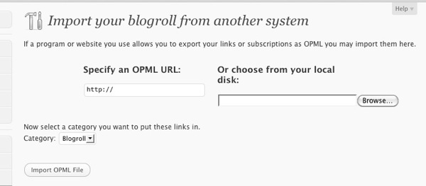
Next in the import page, you can either paste in the URL under “Specify OPML URL” or browse/upload the file you saved and click “Import OMPL File.” We’re done, your links should be in your new site’s links library now.
Unfortunately, there isn’t a way to retain the previous links’ category settings. So you’ll have to re-create and re-assign the categories.
For those curious, OMPL stands for Outline Processor Markup Language.
Automattic sites reach 500 million visitors per month
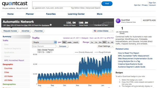
We’re seeing signs of serious traction for WordPress. According to Quantcast (a website popularity tracking service), WordPress.com and it’s family of websites under the Automattic umbrella have reached 500 million unique visitors per month.

Yikes! That’s in the realm of Google, Yahoo, and MSN. But the overhead at Automattic is a fraction of the other companies with only 75 employees versus the other mega corporations numbering in the tens of thousand. Goliaths meet our David.
We can’t help trying to corollate this spike with Microsoft recently switching their personal blogging users over to WordPress in late November. If you look on the graph above, Automattic’s traffic doubled in November/December. Coincidence? Probably not.
For the infrastructure geeks, we were blown away that Microsoft would convert those blogging users over to WordPress which usually runs on the LAMP (Linux, Apache, MySQL, PHP) system which is one of their biggest threats in terms of server technology.
This ranking would not include self hosted WordPress.org web sites.
See it: Quantcast
Via: Toni.org
Great way to find themes visually – Theme Finder
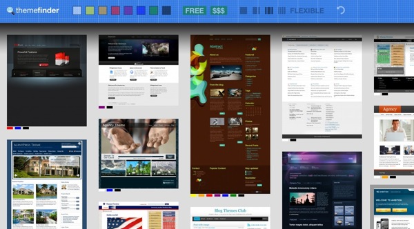
Looking for a beautiful WordPress theme? The choices have become daunting with 1,000s of themes. We ran across the theme finder site from WP candy that might make it easier for WordPress site builders to find that perfect look.
The concept is brilliant, show a bunch of theme home page thumbnails along with some criteria at the top of the page to filter results. The filters include general color scheme, free, paid, number of columns, and “flexible” (not sure what that means yet). Clicking on a filter, will gray out non-matching themes. Brilliant.

Check it out today: themefinder.wpcandy.com
Replace your login with an Ajax plugin
Once in a while you run into a WordPress plugin that just blows you away. I think Login with Ajax is one of those.
On the surface it works as a widget that shows a user/password login field on your sidebar area. It will also show a user’s gravatar photo if they’re already logged in along with logout button.
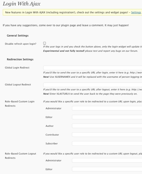
The interesting stuff is the extended functionality with membership-like login role redirection rules, in other words depending on the user’s role it can redirect them to specific pages.

The plugin also supports re-writing the standard welcome email that’s sent to newly registered users. The developers, netweblogic, should get some thanks from the WordPress community for this excellent plugin.
Get it: Login with Ajax

