A few days ago we mentioned that OnSwipe released their plugin/theme combo to easily make an iPad friendly version of your WordPress site. We took a look at it today and we’ll fill in some of the blanks that aren’t obvious until you actually try it and look around the UI. Basically this plugin will almost “auto-magically” convert your existing WordPress site into an iPad friendly site.
Still confused to what this will do for you? If you’re using a modern WordPress theme, this plugin will automatically “convert” your WP site into something that looks like it’s custom-made for the iPad. People visiting your website on a regular desktop/laptop browser will continue to see the regular WordPress theme and people on an iPad (it doesn’t work on iPhone yet) should see a special version of the site.
Let’s walk through a typical installation. For this example, we’ll use a test site for one of my clients, “Beautiful Day Photography.” I am currently converting her site from Flash to WordPress (yay!). On this project for now I am currently using the Graphpaper Press theme Modularity.
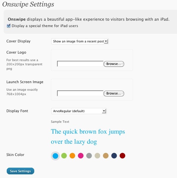
So once you’ve downloaded, installed, and activated the OnSwipe plugin, you’ll go to Appearance and select the OnSwipe options. You’ll see a control panel like this:

We tried to upload a transparent PNG logo but it didn’t like it until resized it exactly to 200×200. You can choose which image to display on the home (“launch”) page. You can also select from a set of non-standard web headline fonts and a skin background color. There are no other options on the backend other than this panel. One thing we noticed is that there isn’t a way to specify an iOS home page bookmark/launch icon in this interface.
So what will your visitors see? Your custom logo will appear on the splash page of the site when a visitor goes to the site on an iPad. The user will have to swipe their finger right to left to “open” the page.
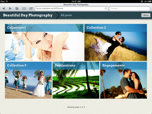
Next they’ll see a page like this:

As you can see this plugin was able to take the home page content using the Graph Paper Press theme and reformat it automatically for the iPad’s screen size. It even displayed the NextGen photo gallery on inner pages as well. Unfortunately there’s no swiping support built into NextGen gallery plugin yet so the experience isn’t seamless as it could be.
One of the things we noticed is that for now OnSwipe plugin isn’t going to do anything for iPhone 4 Safari or Android web browsers yet. We’re surprised that this plugin doesn’t support iPhone Safari since it’s essentially the same thing as an iPad.
If you’re looking to set up a quick and easy iPad experience for your WordPress site, you can’t beat OnSwipe and best of all it’s now free. If you’re site happens to be on WordPress.com, you’ll notice that Automattic has already added this plugin for you.
Get it: OnSwipe theme/plugin
Update: Here’s a quick preview plus video of the newest version of OnSwipe coming in late June!


