You have probably noticed there a lot and I mean a lot of commercial WordPress theme companies out there. It seems like a new one is popping up every month. Let’s take a quick look at one of the veterans, Graph Paper Press.
Graph Paper Press specializes in photography focused themes so the grid paper metaphor and minimal use of text is prevalent in most of their themes. So you’ll see a lot of big photos blocks and less emphasis on text. The great thing about GPP is they give away most of their themes away for free use along with some light documentation. If you need support, then you’ll have to pay of course.
Let’s take a quick look at two of my favorite themes: Workaholic and Berlin.

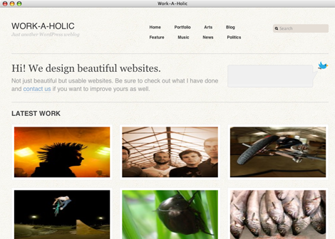
Workaholic is a photography/art portfolio theme that I use at my SGVPhotos.com site. It has a home page intro and rows of 3 across thumbnails. When you rollover the thumbnails, it reveals the title and category. It’s perfect when you think pictures are worth a thousand words.
When you drill down to an inner page, there are tabs that will allow the visitor to see multiple photos on the same page via AJAX. There’s also an automatically generated list of similar photos to the right. As a testament to the solid code behind it, I was using a version of Workaholic that is several versions behind the current version and I recently upgraded the site from WordPress 2.8 to 3.04 and the site still works beautifully with the older Workaholic theme.

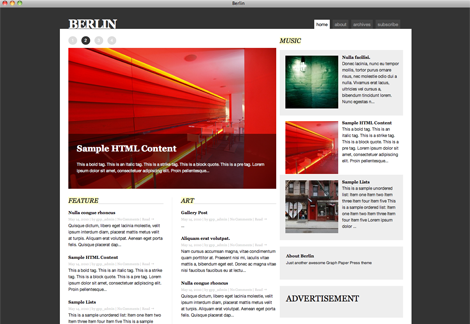
Berlin is a deviation from their usual that’s meant for both photos and text. It has a large article block in the left column and there’s a smaller right column that can be used to show posts or other widgets. It’s very easy on the eyes and it’d be great for a magazine or news blog. I haven’t used Berlin myself so other than seeing the front end, I don’t know about the workflow and backend usability.
So hats off to the Graph Paper Press folks for giving back to the WordPress community in such a big way with a ton of polished free to try themes.
Get it: Workaholic | Berlin


