A few weeks ago we looked at two Graph Paper Press themes aimed at photographers and artists. We like GPP (Graph Paper Press) themes because their grid based layouts and great use of negative space. After all do you really need to fill up every single space of a web page?
So when we were recently contacted by a photographer friend and asked to redo her Flash based website, we didn’t hesitate to create a demo site for her with Graph Paper Press’ Modularity theme.
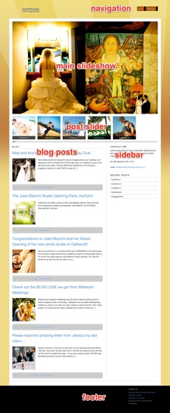
Here’s a quick overview of the Modularity theme home page (click image for larger size):
The theme follows the usual WordPress layout with a header area which includes: logo, navigation bar. Below that is a main image area with slideshow functionality, blog posts, and a sidebar. Two slight twists are the inclusion of two sliders: one is a thumbnail post slider and a larger feature article slider positioned below the main slideshow.
Unfortunately during our testing we were informed by GPP tech support that it’s not very easy to resize these thumbnails in that slider so you can’t easily set a fixed amount of thumbnail posts to perfectly fit the width of the page. We also thought having a secondary featured post slider was somewhat distracting so we disabled it. You can see the secondary featured post slider in action on GPP’s demo site here…

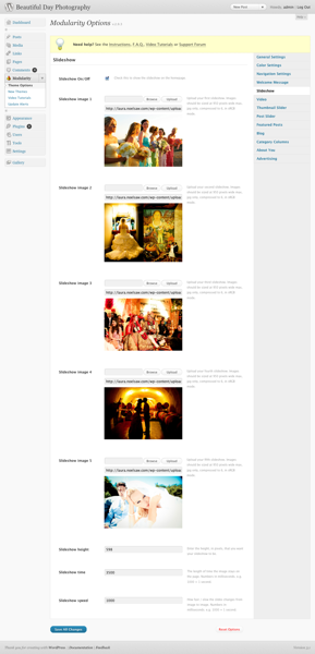
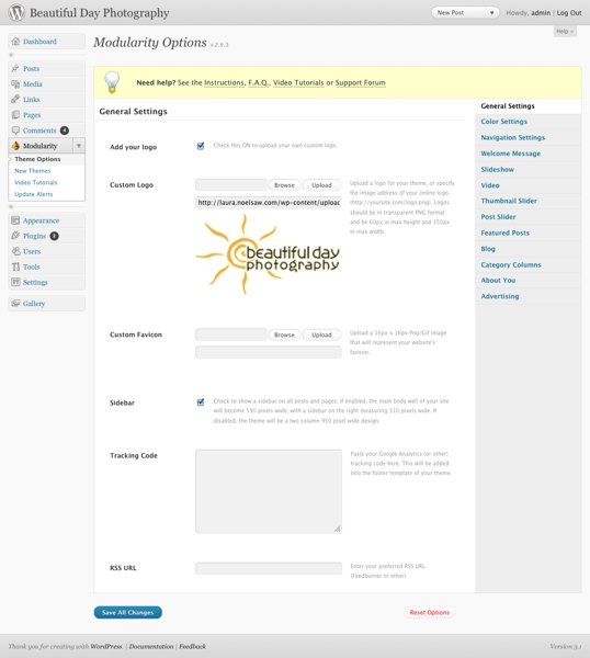
As you can see in the panel options, you can specify up to 4 images and timing for the main home page slideshow. Using the other theme panel tabs you can easily customize other site setting’s like the site logo, page background image, or font colors.

You can also define up to 5 columns of content right above the footer by specifying them in the theme control panel. What may throw you off is that this section is called “Category Columns” in theme panel which doesn’t really describe that it’s closer to the footer area. Eventually you’d figure it out though.
The major drawback with Mouldarity is that it’s very strong on the home page presentation but unless you install a plugin like NextGen gallery, there’s no built-in gallery function for the inner pages. Without using a gallery plugin, the inner pages would consist of simple thumbnails sorted in a blog-like fashion. See an inner page example from the GPP site….
However overall ease of use trumps our misgivings. Modularity is one of those rare themes that an intermediate skill level WordPress user could figure out without reading any documentation. It’s not a perfect theme but it works well out of the box and would be great for any image oriented WordPress site but not necessarily a portfolio site without having to resort to a gallery plugin.
Get it: Modularity


