We took a look at the free version of Platform Pro a few months ago and were impressed with the features and customization options enough so that we bought it. So we recently built a traditional blog for a client with the commercial version of Platform Pro. We also looked at Jetpack plugin when it first came out a few weeks ago but were turned off by some bugs typically found in a version 1.0 product. Pagelines So we decided to take a second look at both Platform Pro and Jetpack at the same time. These are not meant to be full reviews but provide some key insights in a short amount of space.
Platform Pro
During the process of customizing our client site we were reminded of how powerful Platform Pro can be but there are a ton of options to look through. One of the most powerful features allows users to select what kind of modules show up on each type of page (home, blog, individual posts, etc.).
For us, this process became be downright confusing when we had to figure out which page type we were modifying. We had to keep refreshing the published page to see which page type we were editing at the moment. It’d be great if there was a preview or explanation of which page type was being currently edited.
We also wish there was a simple footer module that could be used instead of 3 or 5 column design that forces the user to show extra content when it may not be needed or desired.
Also as we mentioned in our previous review, some similar options are saved into two different pages. For example the social network features of the theme appear in three separate pages: global options (footer Twitter feed), Template Setup (post/page sharing buttons), and Header and Nav (Social Network profile URLs). Our suggestion would be to perhaps keep these fields on their current pages but also add a new page that has all the social media features on one page.
Platform Pro when it was first released was great for its time but the complexity of the theme panel is starting wear us down even after we’ve used it on several sites. Call us hypercritical but if we’re confused, imagine what a new WordPress user could feel like. We hope the next major revision of Platform Pro improves the grouping of menus/options and provides a more intuitive way to build page types.
Jetpack
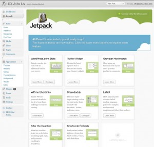
When we were first tried Jetpack, we didn’t try the bundled Twitter widget so this was a good time for us to try it out.
Some people once seeing it on their site may be disappointed that there’s not much options for color styling. The Twitter Widget looks very plain and boring but heck it works without very little effort or configuration. We’re using the standalone version of the widget, here on our site on our sidebar, so you can see it’s very plain-jane.
If you want something that’s slicker and customizable with colors, we’d recommend the Twitter Goodies Widget by NetWebLogic. It’s a bit more effort to customize the color but it maybe worth the effort to some.
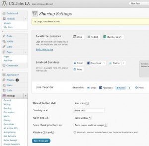
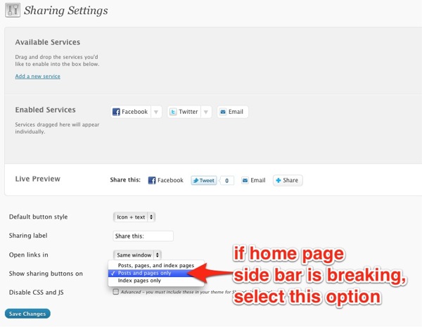
Here’s a tip for Jetpack (and Sharedaddy stand-alone) plugin users who are using Platform Pro. If you enable Shareadaddy to show sharing buttons on the home page, your sidebar widgets may wrap to the bottom of the page into the footer area. And it currently doesn’t show the share buttons on the home page anyways so selecting it doesn’t work in the first place. To fix the sidebar from appearing in the footer, you need to set the display to show only “Posts and pages only.” See the screenshot below.
Get it: Platform Pro theme / Jetpack plugin


