WordPress 3.2 is coming soon – sometime in late June. So here are some of our thoughts and preview of it in no particular order on the latest beta version. By no means is it meant to be an in-depth review – for a more thorough look at 3.2 beta, check out WPMod’s review. Note that things may change between now and the final 3.2 release.
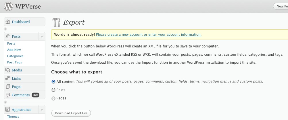
Once you login to WP admin, you’ll see there’s a whole new look to the whole admin system. Our “nitpicky” take is that the some of the proportions aren’t as well thought as the current 3.1x releases. By proportions we mean the sizing of certain text and images relative to each other.
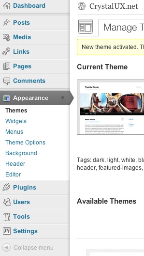
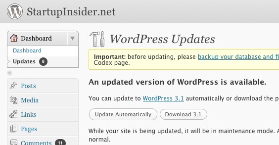
 The new admin vertical navigation bar now uses less space so more usable area is saved for the rest of the page but upon first impression it’s not as pretty as the current release. On the functional side it does show which module you happen to be in much more clearly with a right pointing arrow.
The other big change is the full screen post/page editor now has “distraction-free” writing with a minimal set of toolbar icons. The toolbar will also fade away once you start writing something. It’s very “zen-like” and great way to focus on creating content.
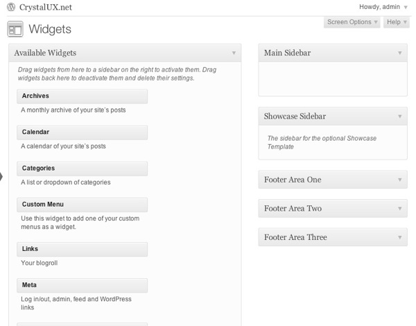
As for the new Twenty Eleven theme itself, we think it’s a great evolution for the default theme. There are a ton of widget areas which should make content areas really easy to populate. 
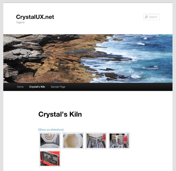
One of our main concerns was that it seems to have a lot of vertical spacing between the navigation bar and page title.

We also ran very quick tests with the NextGen gallery, Enable Media Replace, and Autoptimize plugins, all which seemed to work without a hitch. We ran these plugins through their paces by creating a gallery, overwriting an image, and seeing if the CSS/HTML were optimized. Basically these plugins seemed to work and didn’t crash the site. It’s not an extensive test but we were able to see the basic functionality was in good shape.
So that ends our quick look at WordPress 3.2 beta. Stay tuned for more in the upcoming weeks.

